
Disguised ChatGPT or Claude looks like a plain document editor, not a chat window. Docognito draws a title bar, a working menu bar, a formatting toolbar, and a page over the real site, and the screenshots below show each of those parts up close rather than describe them in the abstract.
The chrome around the page
These screenshots were captured from the extension's own test build rather than a live logged in account, so the conversation text shown later on the page is a stand in. The chrome itself, everything described in this article, is the real disguise, rendered exactly as the shipping v1.0.43 build draws it.
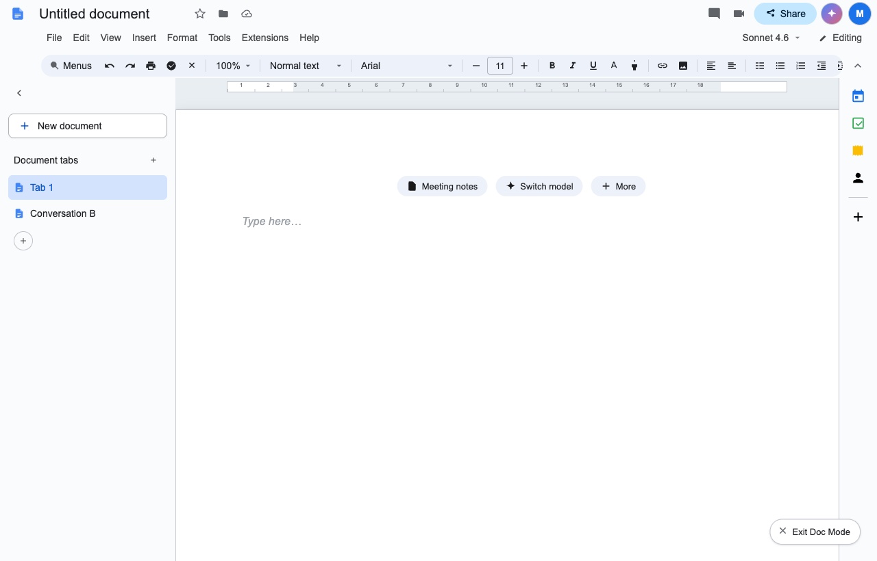
Across the top sits a title bar reading Untitled document, with a small star, a folder icon, and a save status icon beside it, then a row of icons for comments and video, a light blue Share button, and an account circle, the same cluster a document editor would show. None of it is one static image. Every element is built from the real page underneath, which is why it keeps working as a conversation grows rather than freezing at whatever the page looked like the moment the disguise switched on.
A menu bar and toolbar that behave like the real thing
File, Edit, View, Insert, Format, Tools, Extensions and Help sit in a row under the title bar, and each one opens into a working dropdown rather than sitting there for show. Below that row is a formatting toolbar: a zoom control set to 100 percent, a paragraph style dropdown, a font dropdown set to Arial, a size box, bold, italic and underline buttons, a text color control, a link button, an insert image button, alignment buttons, and list and indent controls, the same lineup a document editor would carry. A ruler marked off in inches runs above the page itself. None of this is decoration a person could see through with a second glance, since a menu that opens and a ruler that measures are both things a static image cannot do.
Document tabs, where conversations sit as files
The panel on the left carries a New document button above a short list. In the screenshot above, that list holds two entries, Tab 1, highlighted as the open one, and Conversation B underneath it, each with its own small page icon. A plus button below the list adds another entry. Clicking one of those entries opens the real conversation behind it, so the list is not sample content dressed up for a screenshot. It reads as a set of document tabs because that is what the labels and icons are built to say, while the history underneath is an ordinary chat list.
The page canvas and how a reply renders
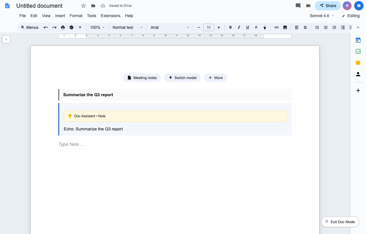
With the panel collapsed, the page reads as a distinct sheet set against a gray workspace, with only a small arrow on the left to bring the tabs back. On the page itself, a message that was sent appears as a bold heading rather than a chat bubble, a labeled box below it marks a place where the assistant produced reasoning before answering, and the answer renders underneath as ordinary text, with a new Type here placeholder waiting below that for the next message. The title bar in this shot also reads Saved to Drive next to the title, the kind of status line a document editor prints while nobody is looking at it, which is one more reason the page reads as a document rather than a chat log at a glance.
The model control in the menu bar
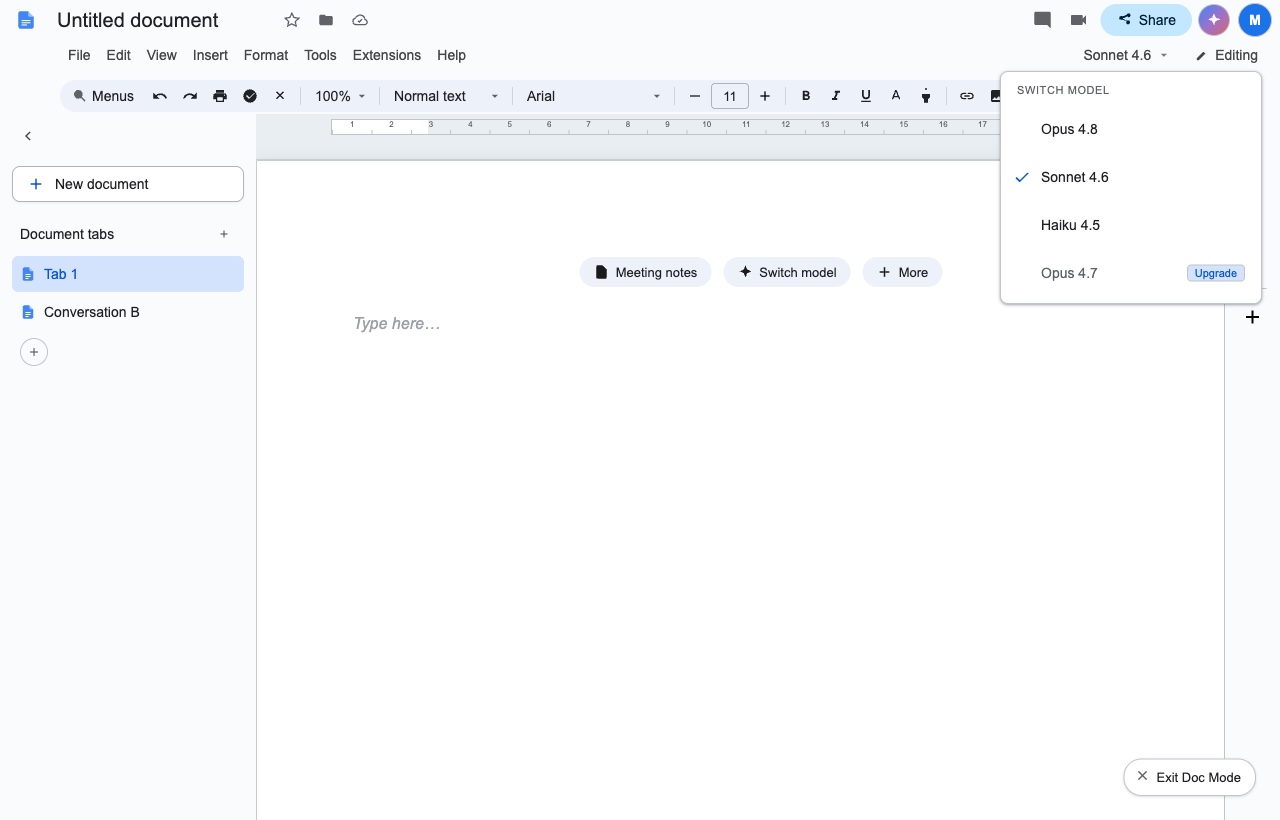
Near the top right of the menu bar, a small chip names the model in use, Sonnet 4.6 in this shot, next to a pencil icon labeled Editing. Clicking that chip, or the Switch model suggestion that sits on a blank page alongside Meeting notes and More, opens a dropdown headed Switch Model. It lists each model by name, marks the current one with a checkmark, and grays out any model the account cannot use, with an Upgrade badge in place of a checkmark. Choosing an available model changes what answers the next message, the same way switching models would work with the disguise off, and a locked entry is never selected on a click.
What stays real underneath
the address bar, which still reads claude.ai or chatgpt.com, no matter how convincing the page above it looks, because the redraw happens inside the page and the address bar sits outside it. The small Docognito icon in the browser toolbar stays visible too, for anyone who opens the extensions menu directly. The Exit Doc Mode button in the corner of every shot above turns the page back to the real site with one click, and Shift and Escape, which both hides the disguise and brings it back does the same thing without touching the mouse. A closer look at what the address bar reveals and what it does not is in the address bar guide, and what a passing glance actually catches is in what a coworker's glance actually catches.
The page changes; the address bar does not
Two different goals are at play in what is shown above. For a page that reads as an ordinary document to anyone glancing past it, with menus that open and a model switcher that works rather than a flat picture of one, that is what the screenshots above show working. For the browser itself to stop naming the site that is open, no redraw of the page reaches that far, since the address bar sits one layer above it. Add Docognito and open the same page shown here.